Silver Sea
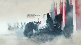
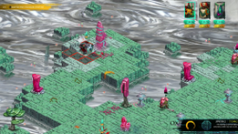
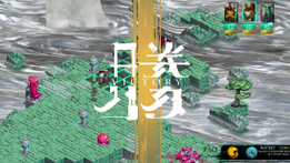
Silver Sea is an asian inspired, turn-based strategy game, where a once powerful emperor manages to elude death with the power of the cinnabar crystal. He proceeds to conquer the quicksilver lands of death together with his loyal army. So it falls on the three demigods, Ox the tank, Pao the ranged fighter and Crane the healer to restore the balance and stop the emperor at all cost.
Specification:
- School project: 8 weeks(50%)
- Level editor: Tiled
- Engine: In-house
- Team size: 9
- 2 Level Designers
- 3 Artists
- 4 Programmers
My contributions:
- Level design
- Game design
- Mission design
- Set dressing
- Balancing
- Tutorial
- Sound design
- Bug finding
Tools:
- Tiled
- Adobe Photoshop
- In-house tools
The gameplay
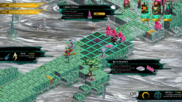
In Silver Sea you control three different characters who all have distinct roles in the party. There is a ranged fighter who picks off enemies at a distance, a tank who soaks up incoming damage and a healer who keeps the characters health up with magic.
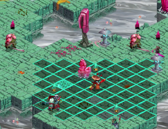
Whenever you encounter an enemy you go into combat mode and then have to spend action points(AP) to either move or use abilities. When your turn is over the enemy will attack you. The game heavily relies on your ability to manage your party members efficiently. For example a good strategy would be to position your ranged characters before charging in with your tank and then use your healer to keep the tank alive during the entire encounter.
As the entire gameplay experience is about 30-60 minutes l had to decide on what to focus on. Either the game would be all-out action pretty much from the start, sacrifising some of the sense of progression or we unlock more characters as the player completes parts of the game.
In this project we decided to go for all-out action and instead introduce new enemies the further the player got into the game.
After each level me and my level design colleague also aimed to give a sense of progression through the way we designed the encounters to continually ramp up the difficulty.
Because of the short playtime we also implemented a kind of rubberband-mechanic. If any of the three characters dies it only takes a few rounds for it to be automatically resurrected. The player only loses the game if all three characters are dead at the same time.
Design and pipeline
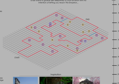
When making levels I used a template that me and my co-designer had created to speed up the process. When the layout was done I sent the document to the rest of the project group with examples of tiles that I wanted to use when creating my map. I also added a timeline so the programmers could see what type of gameplay I wanted to accomplish with my map.
I then made the first pass on the level using Tiled and exported that via XML to play in our own engine. When we had all the levels we wanted I started iterating, balancing and testing for bugs. We then had people playtest our levels in order to get feedback which we used to iterate the levels even further.
One of the things I really like about these projects is that all decisions regarding game design, feedback to the player, sound design, etc. is something everyone can have a say in
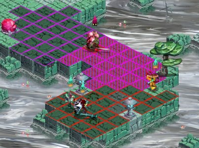
For example there was no way of seeing how far the aggro range of the enemies was. So I came up with a suggestion on how to solve it.
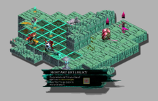
As seen on the left, the red squares is where your selected character can fire his ranged weapon, the purple ones are the enemies aggro range and the striped ones are those that overlap.
It's not the prettiest solution but I believe I had to convince my group to add this feature.
I'd rather have the squares not be the most beatiful squares ever seen, than players who feel confused.
Screenshots

